
Width routing
A single image does not have a fixed width: wider ratios take more of the column, and only images below the float threshold sit beside text.
The four ratios


Start with the two wide ones:
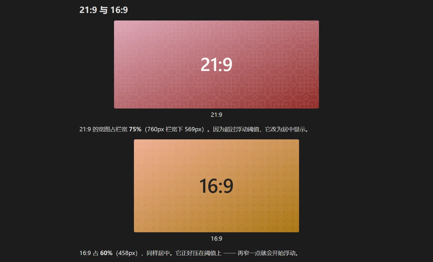
A 21:9 image takes 75% of the column (569px in a 760px column); being past the float threshold it is centred. A 16:9 takes 60% (458px) and is also centred — it sits exactly on the threshold, and a little narrower would start floating.
Now the two narrow ones:
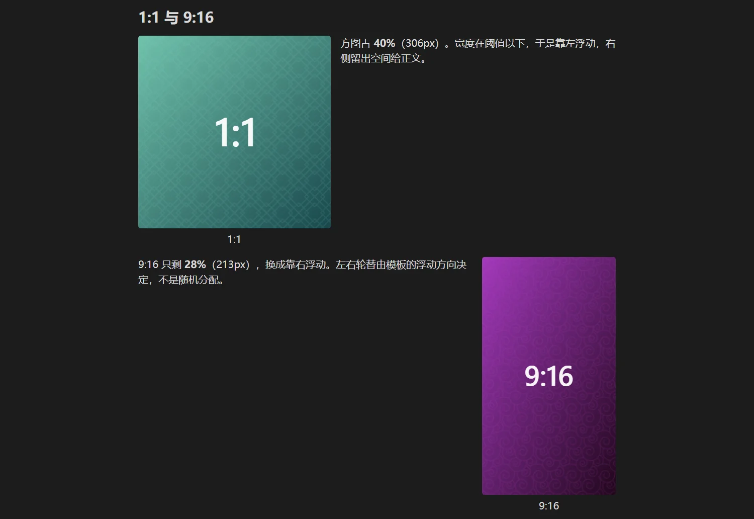
The square takes 39% (297px); below the threshold it floats left, leaving room for text on the right. The 9:16 keeps only 28% (213px) and floats right. The alternation comes from the template's float alignment, not from randomness.
Where the curve comes from
The width percentage is a piecewise power function of the ratio r (width ÷ height). The median ratio defaults to 1.5, meaning a 3:2 photo lands on exactly half the column; towards the extremes the width approaches the limits.
Two settings shift the whole curve:
| Setting | Default | Effect |
|---|---|---|
| Width gain | 50 (neutral) | higher makes wide images wider and narrow ones narrower |
| Median ratio | 1.5 | which ratio maps to 50% of the column |
To replace the curve entirely, use template rules.
When the curve does not apply
| Condition | Result |
|---|---|
ag:width is present | that percentage is used, no computation |
computed width > floatMax (60% by default) | centred block, no float |
column width < mobileBreakpoint (600px by default) | always a centred block |
| the image is in a gallery | row splitting decides, the curve is not consulted |
One practical consequence
Cropping changes the ratio, so it also changes the width: a 16:9 image cropped to 1:1 narrows from nearly full-column to about half. Expected behaviour, not a bug — see Cropping.
Next
- Float and wrap: what happens below the threshold
- Resize, align, reset: change the width with the mouse